When I started redesigning this website a few weeks ago, I started from a blank slate (an empty WordPress theme directory and a couple of Sass files that I use to start new projects). Since then, I’ve built out most of the core components to get the site looking reasonable.
On the surface, a blog design is simple. You have posts and pages and that’s usually about it. But when you dig deeper, you realise there’s lots of little design decisions that need to be made.
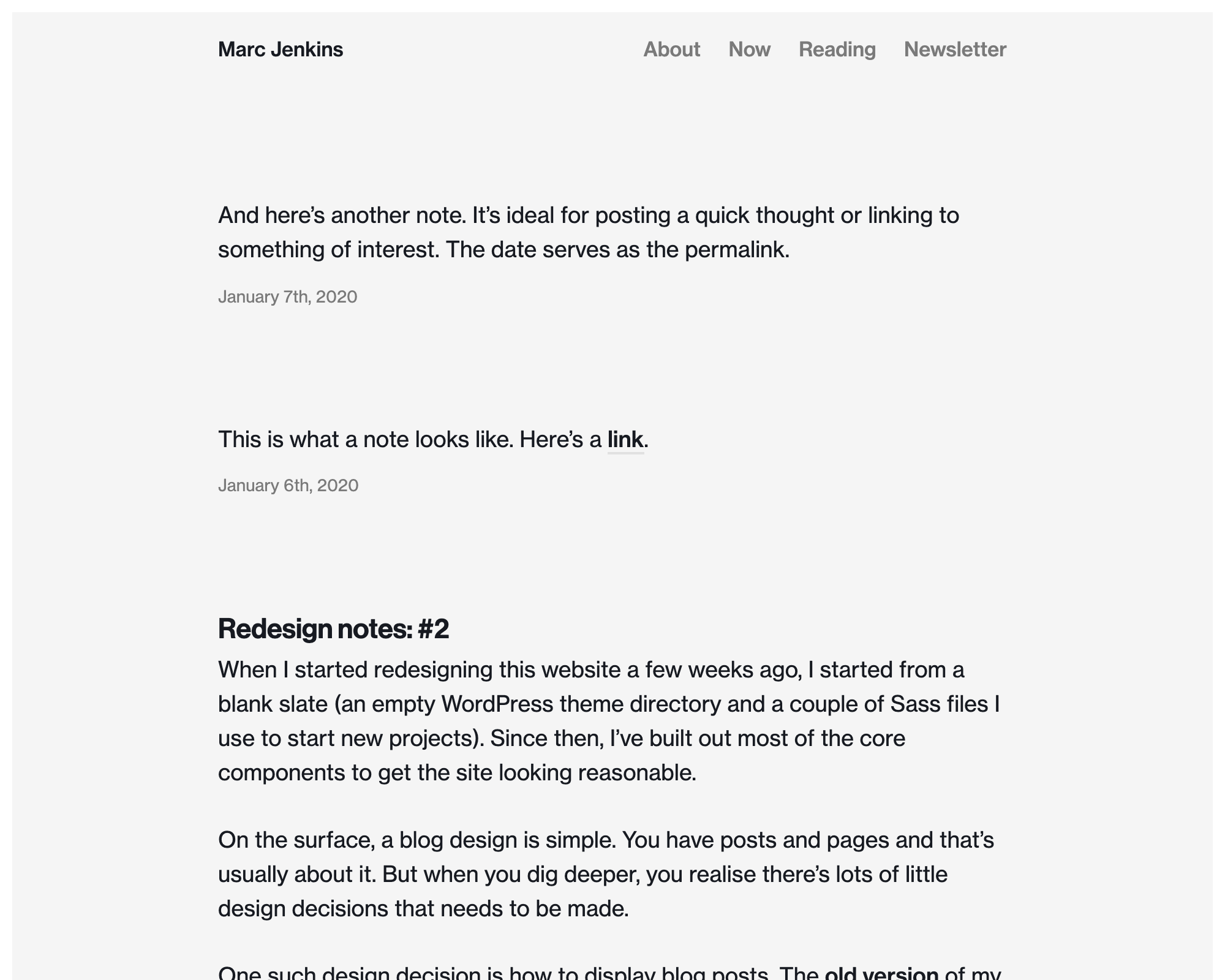
One such design decision is how blog posts are displayed. The previous version of my blog listed posts chronologically, like this:
The previous version of my blog listed blog posts by title
No dates, no content, just a list of blog posts. This approach is fine if each post is a self-contained topic, but it doesn’t feel particularly well suited to a ‘weblog’ where each post can vary in size. Clicking through to a post with two or three lines of text doesn’t feel right.
Now take Manton Reece’s blog as example:
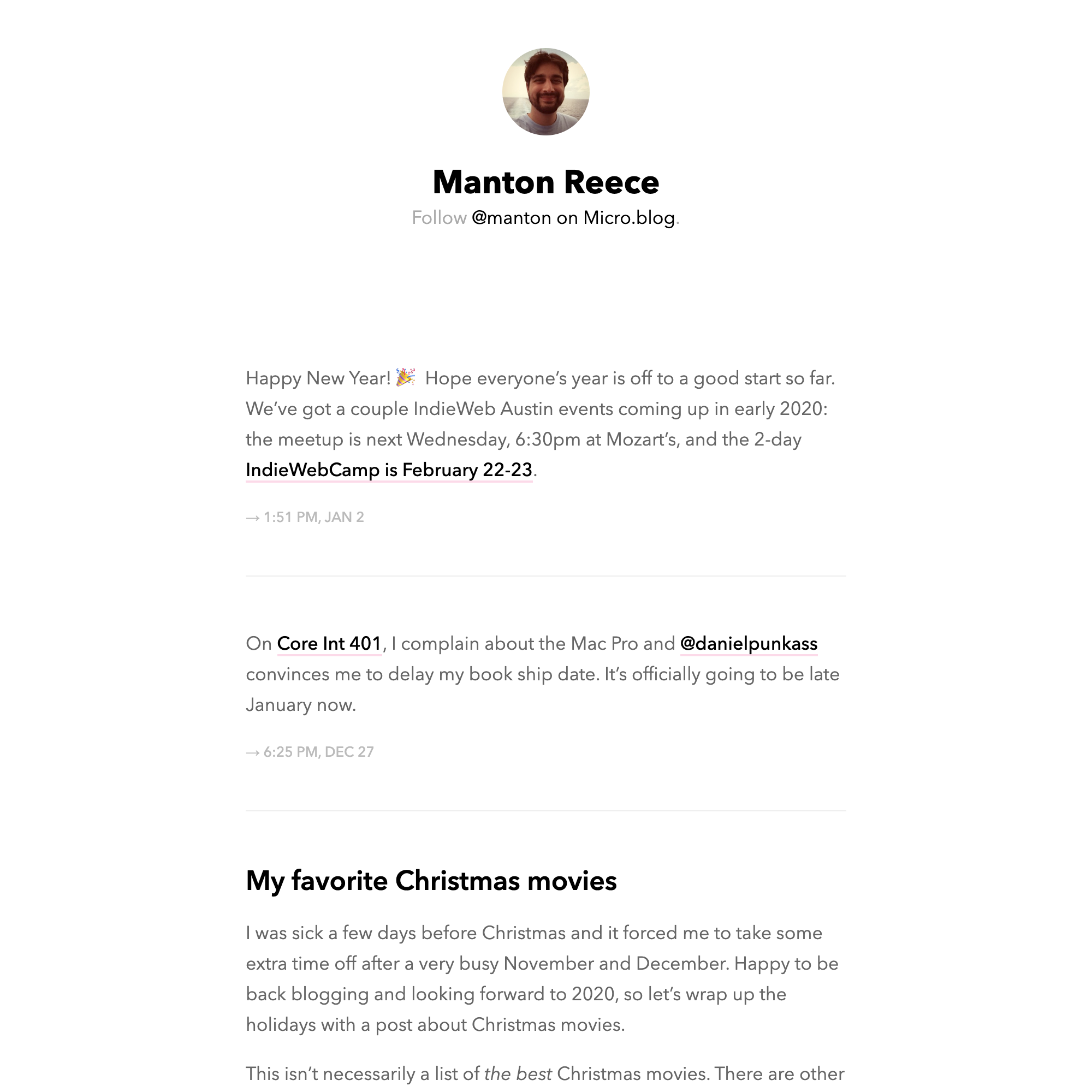
Manton Reece’s blog
Manton’s blog has two types of posts: full articles and microposts. This is the approach I decided I wanted to take. Sometimes I just want to a share a thought or a link and several lines of text is all that is required. This smaller bite-size approach to blogging is called microblogging (incidentally, Manton runs micro.blog).
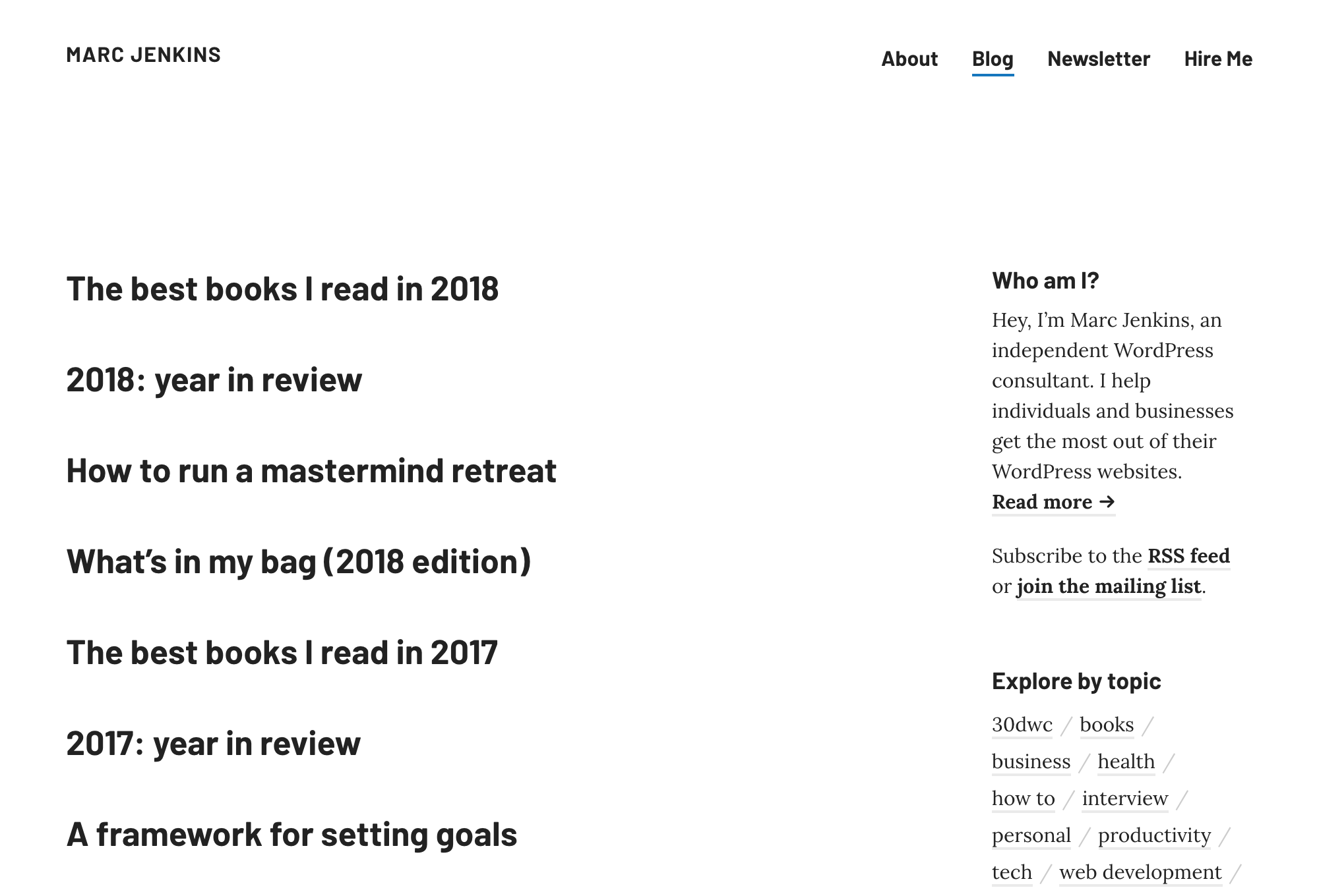
The design as it stands currently
This is the design I’ve ended up with. Very much inspired by Manton, I now have two types of post: a standard post and a note. I’m still experimenting with the format, but I hope that now that a post can be tweet-sized, it’ll make it easier to get back into the habit of publishing.