I recently wrote about my decision to rebrand and reposition my business, 16by9. In this post, I’ll share how I approached the project and some notes from the build. Here's the finished site.
Hiring a designer
I hired Dave Smyth to handle the visual side of the redesign. We'd been friends for a couple of years but had never worked together. It turned out to be a great call and I'm really happy with the work he did.
Content first
Before Dave started on the design, I wanted to get some copy written so he had real content to work with.
He sent me a list of questions to work through, which was really helpful for clarifying my own thinking. Things like:
- What do you have to say?
- Why should people listen to you?
- What do you believe that all your competitors disagree with?
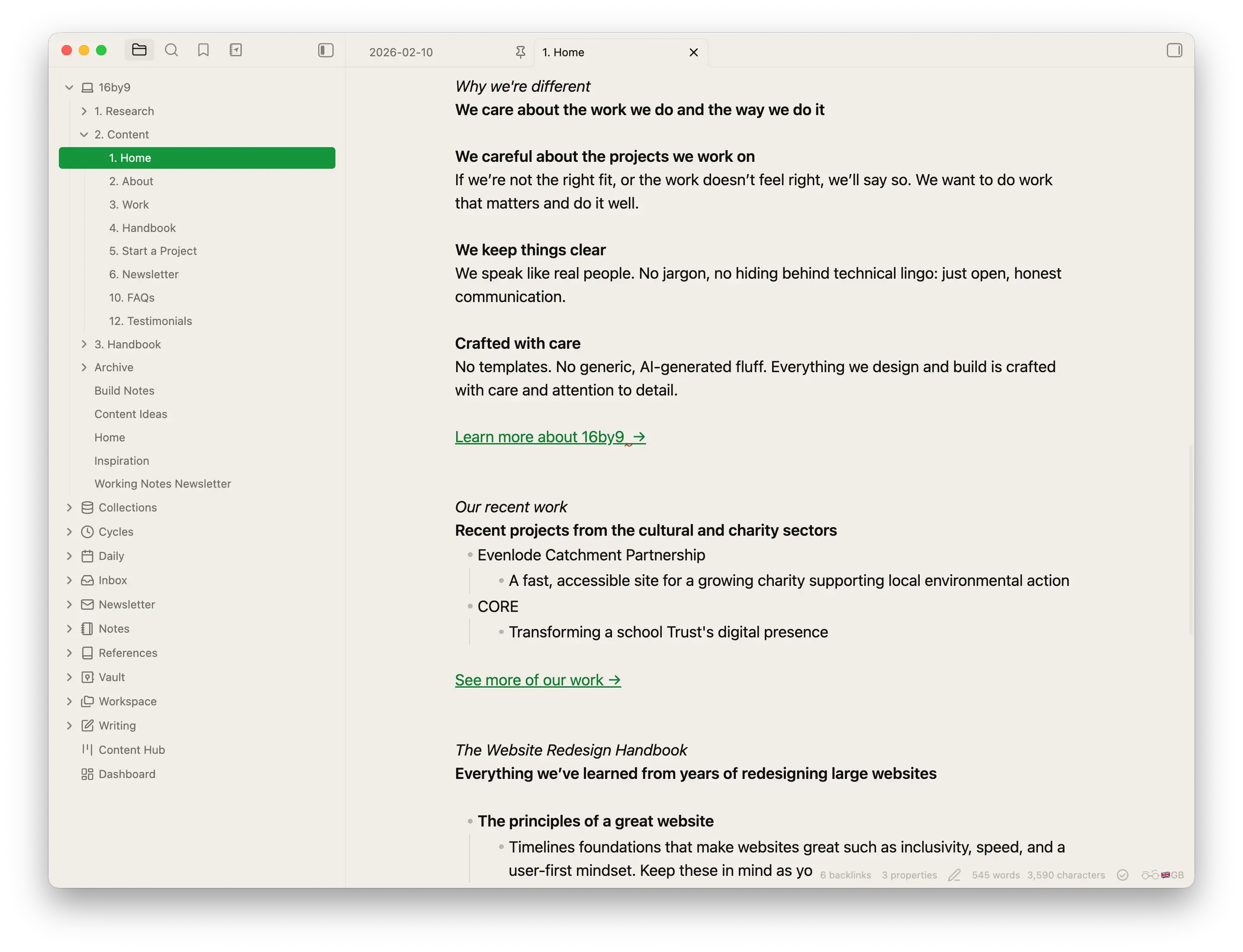
With those answers in hand, I wrote the homepage copy in Obsidian. This meant Dave could design with real content from the start.
It was important to me that I wrote real copy first, because this is what I encourage my clients to do.
The design process
Working with Dave was refreshing (this is not a paid sales pitch, honest!).
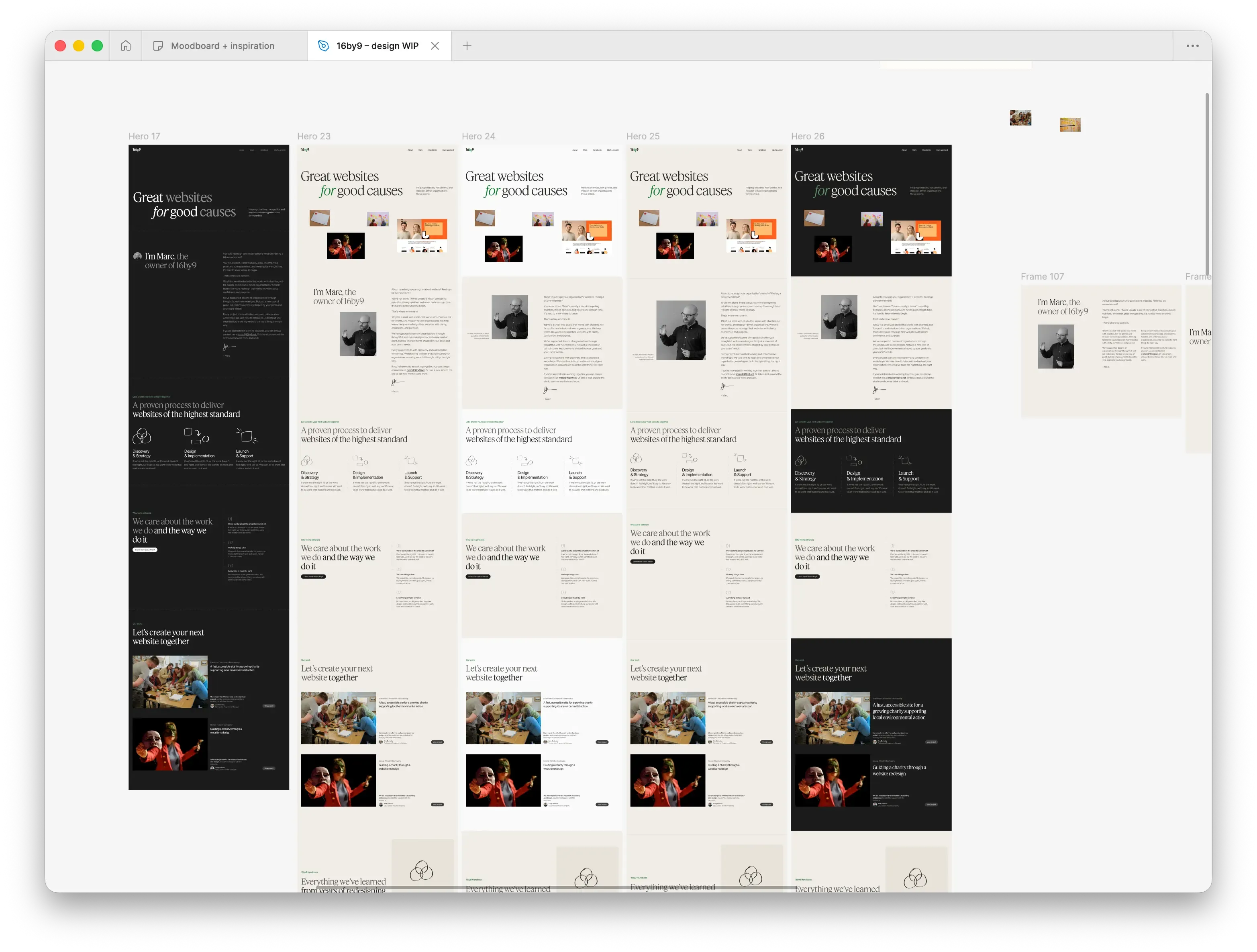
We started by collecting inspiration on a shared FigJam board. We both contributed screenshots of dozens of websites with elements we liked. Dave then organised the board to establish an overall direction for the project.
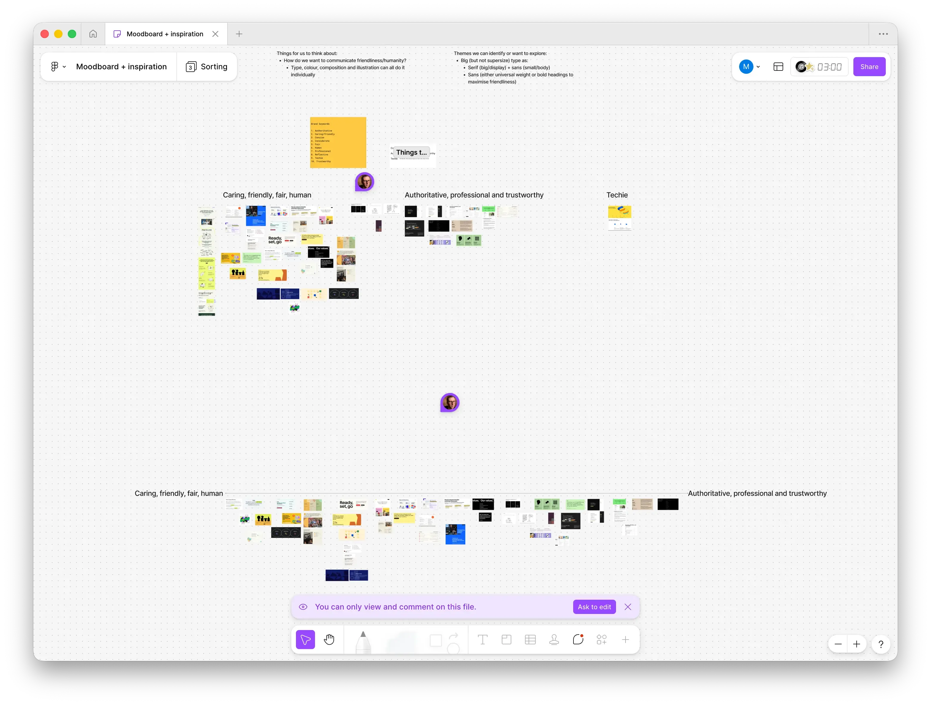
Once we had a rough direction, Dave started exploring typography and colours. I knew I wanted a beautiful serif typeface, and it wasn't long before we landed on Feature Deck.
Söhne became the obvious choice for the sans-serif.
I'm really happy with how the pairing turned out.
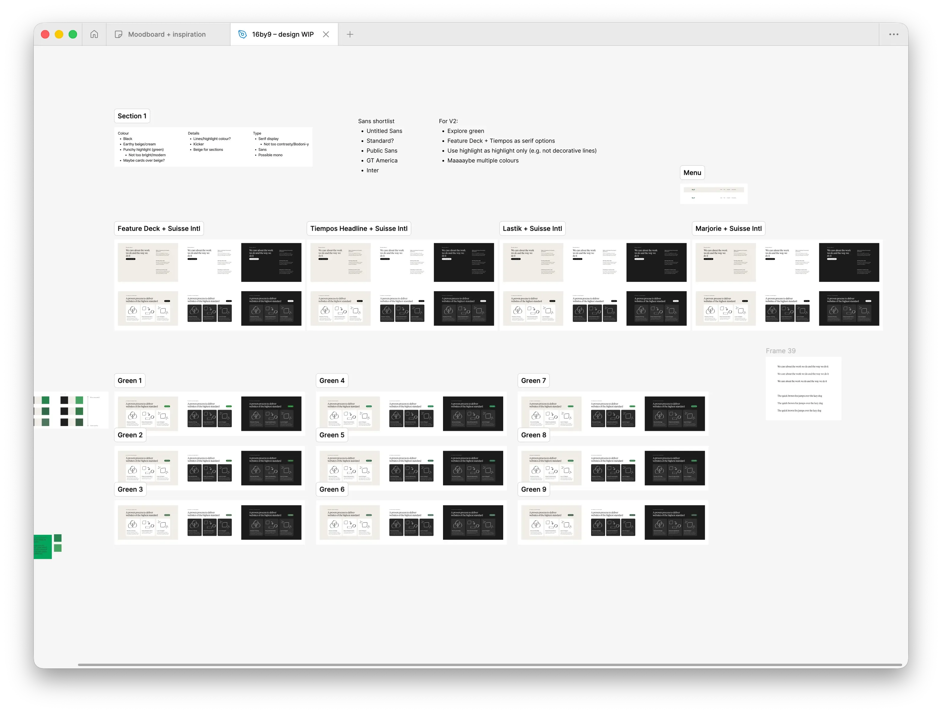
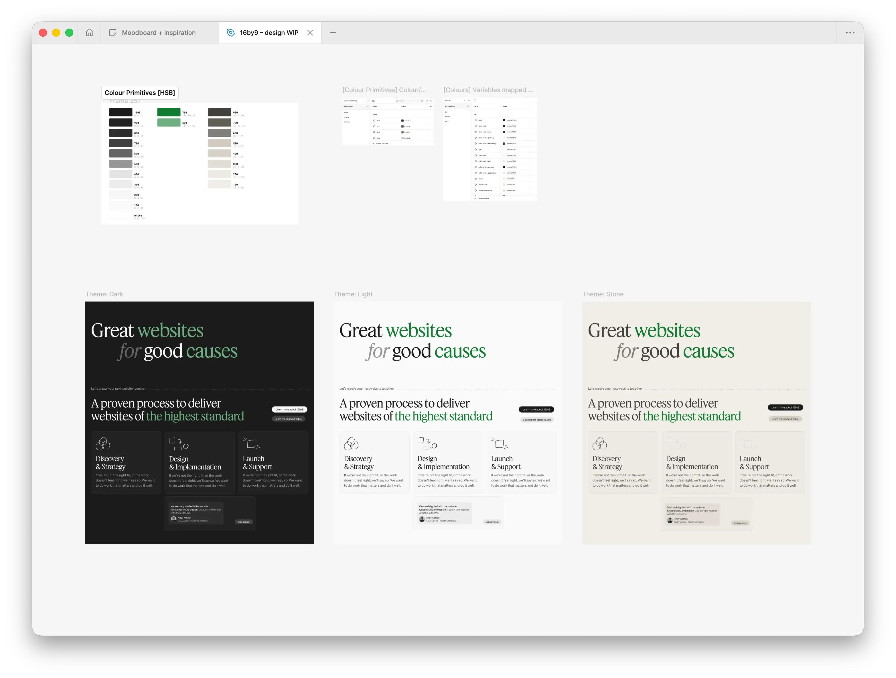
For colours, we went with earthy tones of cream and green. Dave created a flexible palette around these.
Dave likes to iterate constantly, cloning board after board to experiment with new ideas. It was a brilliant way of exploring concepts and fascinating to watch.
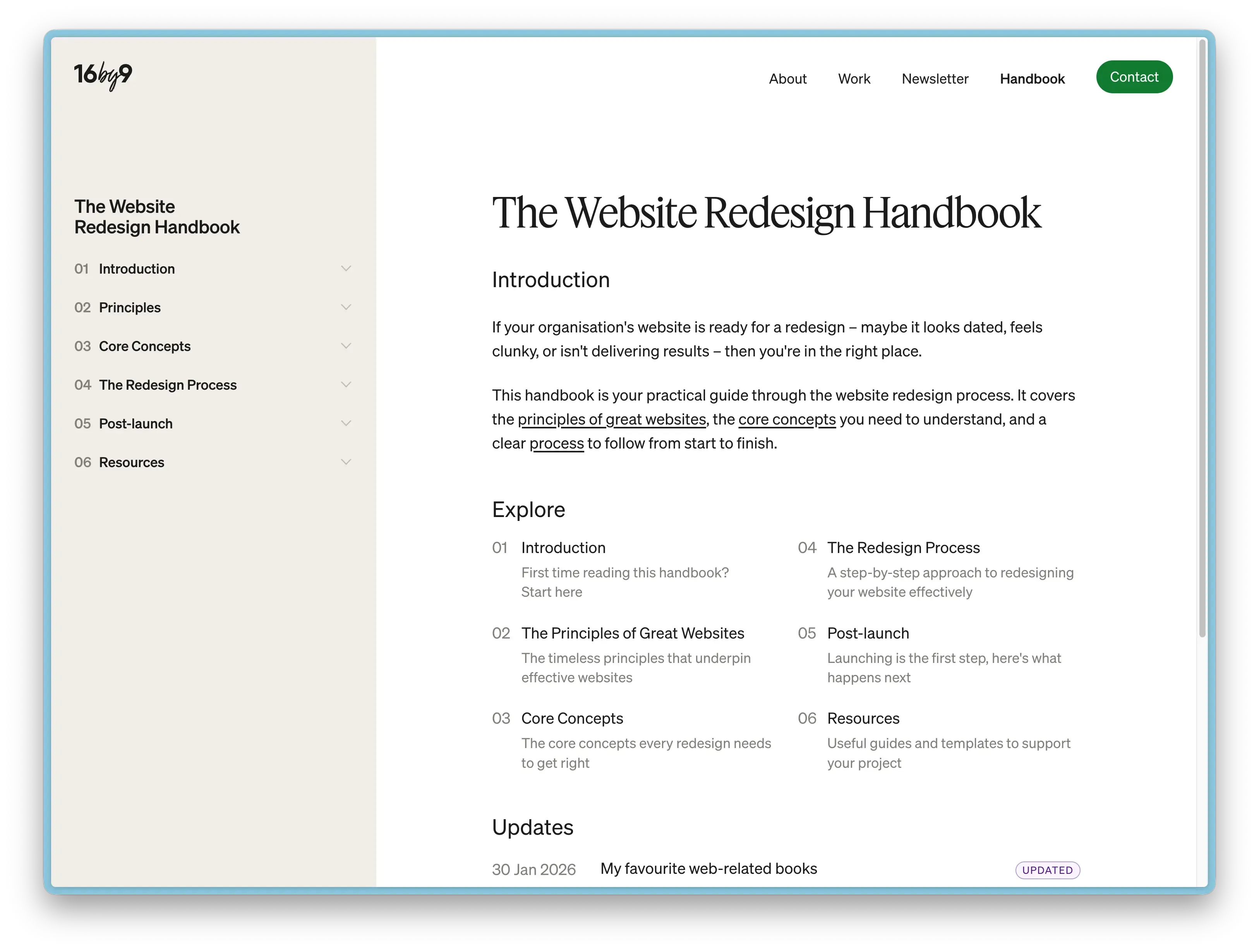
The Website Redesign Handbook
When I started the rebrand project, I spent a good chunk of time journaling either in Obsidian or on my Supernote. I was thinking through my new positioning, who my target audience was, and how I wanted the site to feel.
One issue I kept returning to was what to do with the blog. I could never get excited about writing content around WordPress, and as a result the blog had been gathering dust. But I knew creating good content was important.
Then I landed on an idea: what if I ditched the blog and created an online handbook instead? This solved several problems. It gave me a clear roadmap of articles to write. It gave each article more authority than a standalone blog post. And it felt more evergreen than a date-stamped blog post.
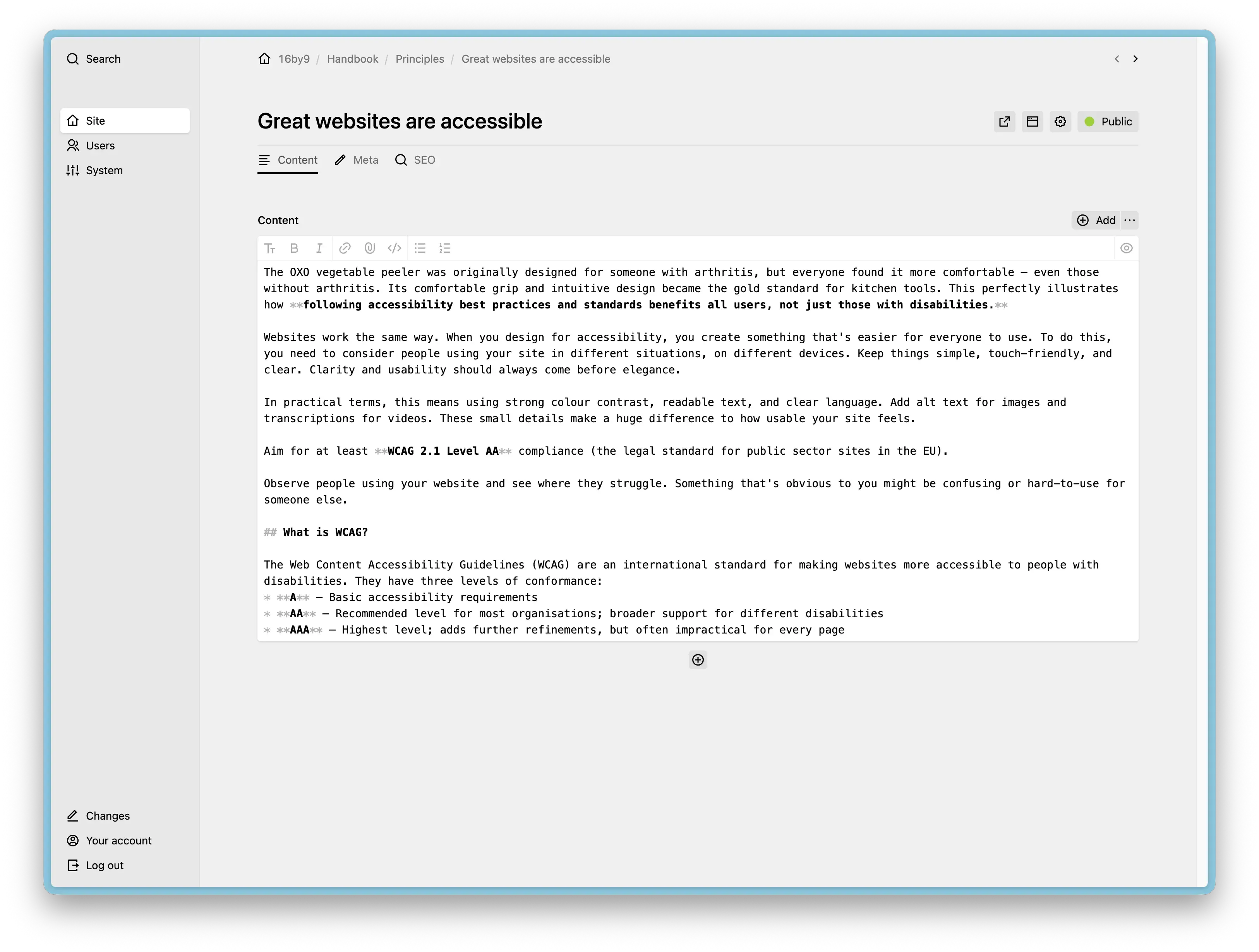
So as part of the new site, I launched The Website Redesign Handbook. It's written for my target audience: organisations, mostly charities and non-profits,who are about to redesign their website. What should they know? What process should they follow?
It's still a work in progress and I'm publishing new articles regularly. The hope is that it becomes a genuinely useful resource, but also demonstrates my experience to potential clients.
Early signs are promising and I've already had lots of positive feedback. Time will tell if it pays off.
The build
Once Dave had the designs at a point where we were both happy, we moved to the browser. I built the site and we finessed things from there, making sure the spacing and type sizing felt right. This is my preferred way of working, using a site on a real devices always feel different to how they appear in Figma.
I opted to use Kirby as the CMS. I hadn't used Kirby for perhaps a decade, so it was great to see how far it's come. Easy to pick up, with detailed docs and a helpful forum.
Having spent most of the past decade using WordPress, Kirby was incredibly refreshing. Amazingly fast out of the box. A clean admin UI. Clean template code.
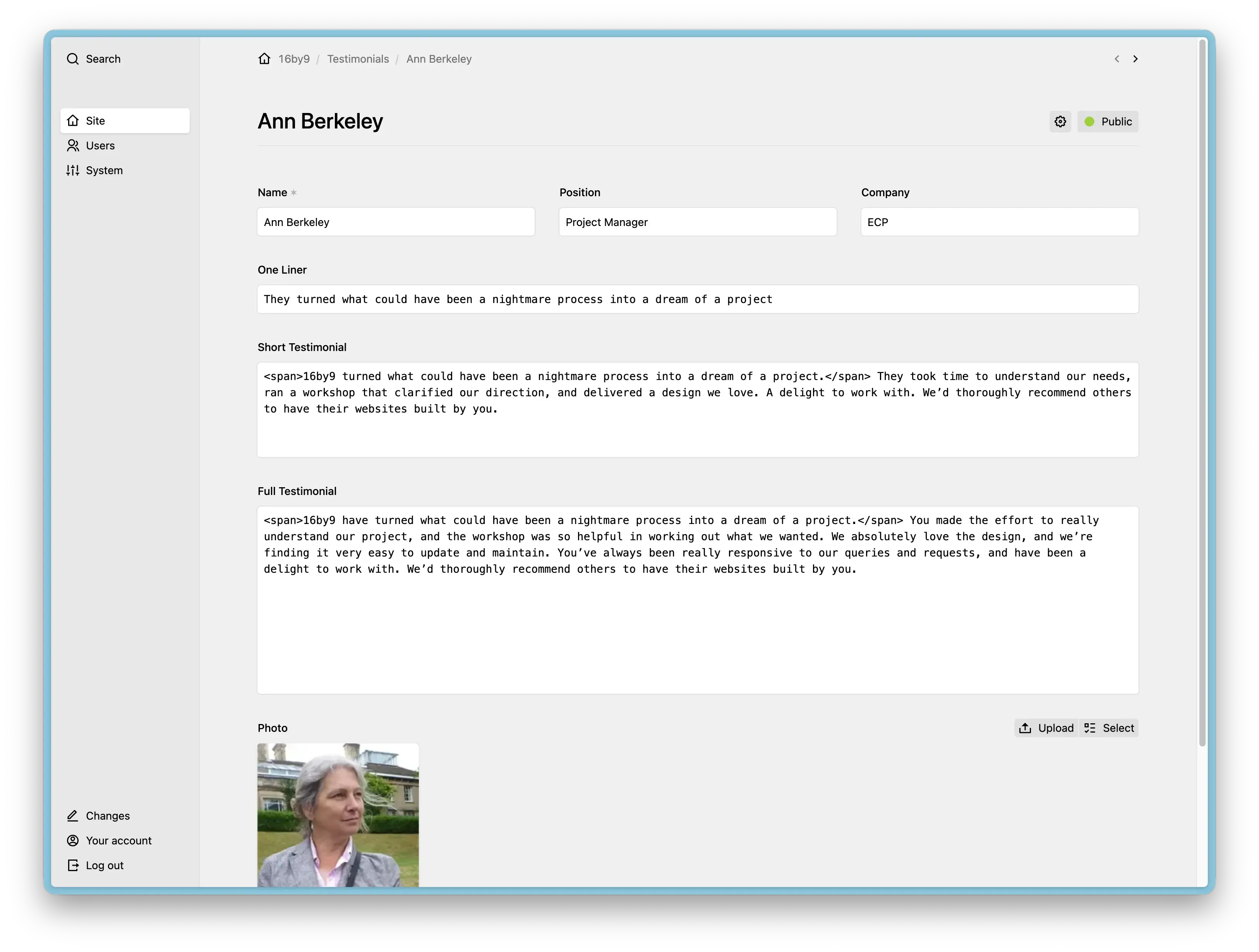
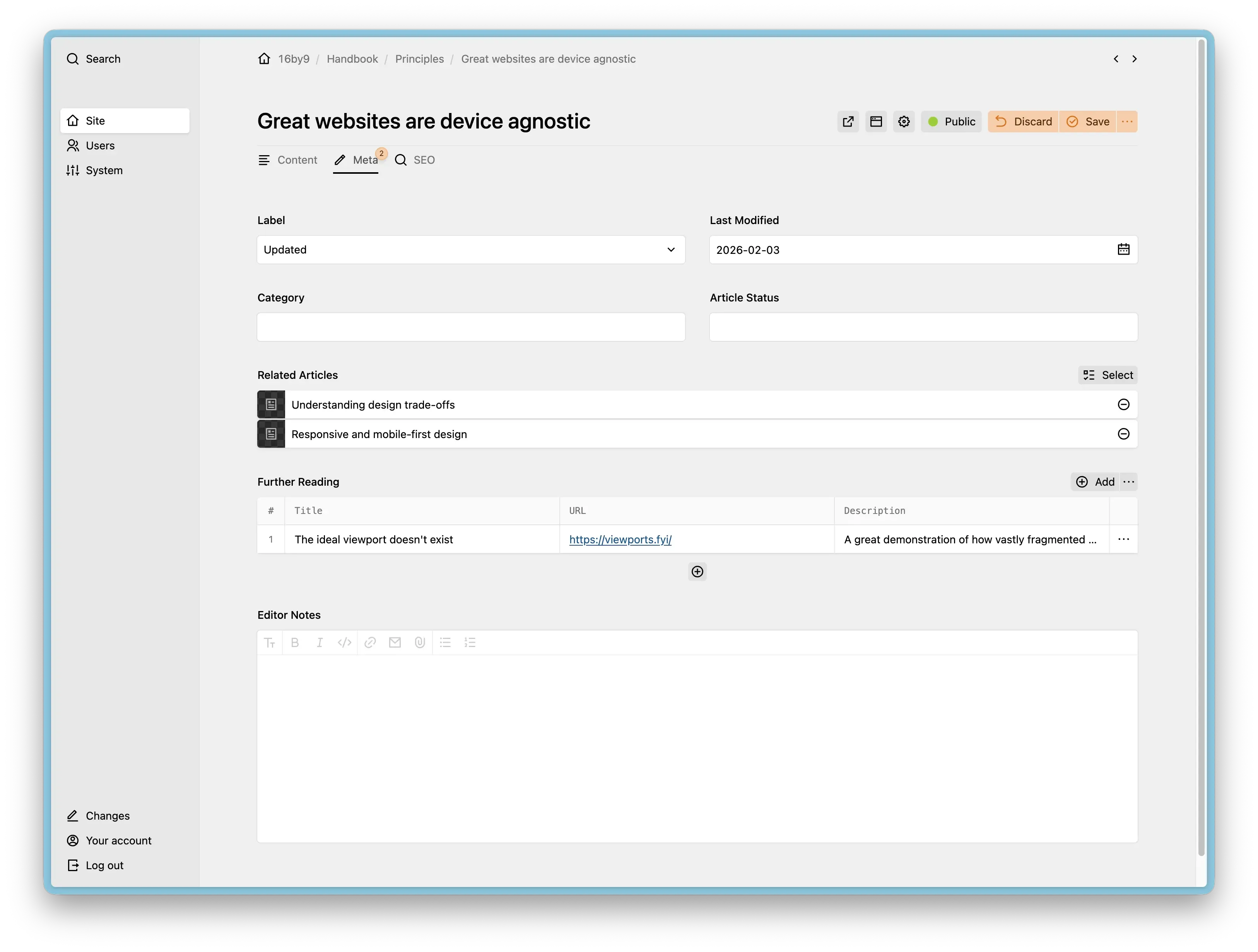
It's really nice having fine control over the Kirby admin panel:
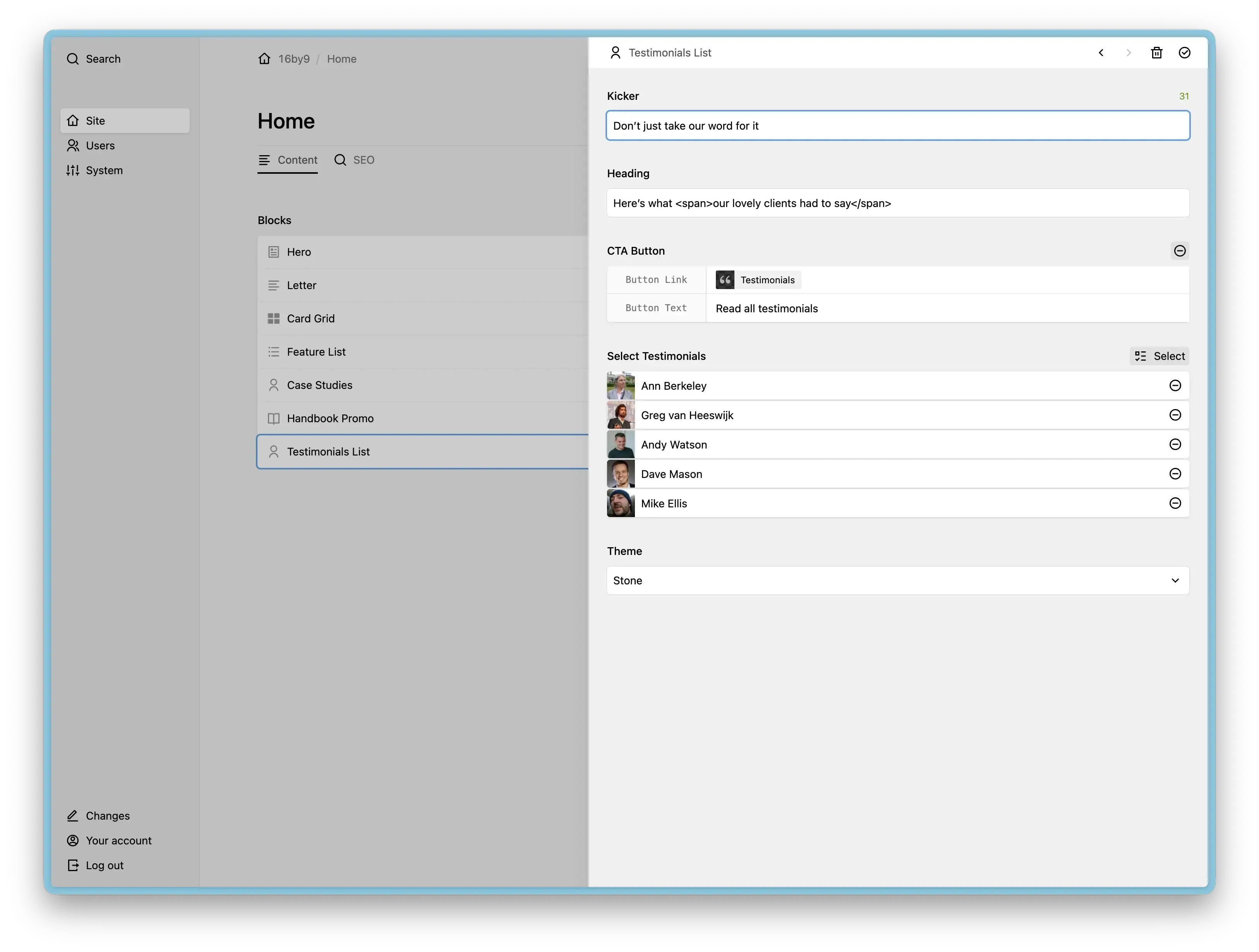
The Handbook added a fair amount of complexity to the build, but it was enjoyable to put together. There's plenty more tinkering I want to do with it, but I'm trying to stay focused on the content for now.
I used a few Kirby plugins:
- Markdown Field — I mostly use this for the Handbook articles. I write them in Obsidian, then copy and paste into Kirby.
- Uniform — for handling forms.
For most client projects, I typically use Sass with Mix as the build tool (I know this is a little dated — I need to migrate to something newer). On this project I went with plain CSS instead. CSS has come such a long way. The only thing I missed from Sass was mixins, mostly for writing media queries. But that wasn't really a problem.
I used ESBuild as the build system. Easy to set up and it builds incredibly fast. No complaints.
The responsive type sizing and spacing was generated using Utopia. It took a long time to get right, but I'm pleased with the end result.
I also experimented with GitHub Actions for deployment. It was a bit of a faff to set up, but once working, it's a really nice workflow. Staging auto-deploys on commit, and production deploys after a Git tag is issued. I initially used FTP-Deploy-Action, but found it painfully slow. Switching to rsync made a huge difference.
What’s next
It's really nice to have a website I'm proud to send clients to. Thanks again to Dave Smyth for collaborating on the design.
My main focus now is:
- Getting my newsletter off the ground with regular monthly emails
- Continuing to write articles for the Handbook
- Writing new case studies